CSS-巧用多重渐变
线性渐变 (linear-gradient):
1 | |
效果如下:
径向渐变 (radial-gradient)
1 | |
效果如下:
多重渐变
注意要点:
background-image属性是可以接受多个渐变值,多个渐变之间使用,隔开- 支持线性渐变和径向渐变互相叠加
- 前面的渐变会盖住后面的渐变
- 渐变的位置、大小均可自行设置
1 | |
效果如下:
进阶
现在我们来观察下如下动图,思考一下我们是否可以使用纯CSS完成呢?
先添加一个div元素,并设置宽高及背景颜色:
1 | |
1 | |
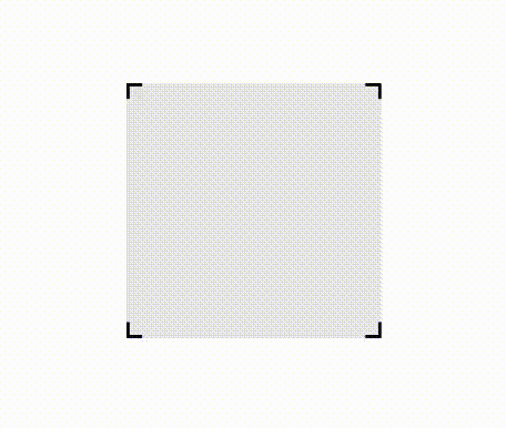
现在它长这样:
现在我们添加一个背景渐变:
1 | |
变成了这样,渐变盖在了背景颜色之上:
解释一下这里的渐变用法,这是渐变的一种不渐变用法,通过设置相同的渐变颜色并指定渐变进度,可以实现类似色块排列的效果,这里就是指定:
- 从
0%到10px是#00b095 - 从
10px到calc(100% - 10px)是#ff000059 - 从
calc(100% - 10px)到100%是#00b095
然后设置渐变大小:
1 | |
因为渐变是可以叠加的,所以我们按照这个思路再添加一个渐变:
1 | |
好的,这里已经初见端倪了,我们再按照这个思路再添加两个渐变(复制前面两个也行),并通过设置渐变位置覆盖四条边界:
1 | |
最后使用transparent替换渐变中的#ff000059颜色,并去掉.Block元素的背景颜色:
1 | |
这样一个纯css制作的四角效果就做好了,需要最终实现效果图那样的鼠标滑过动画,只需要在.Block元素下添加一个before伪元素,并将实现的四角渐变应用过去,同时添加:hover样式以改变大小就可以了,终于代码如下(根据需要替换#00b095颜色):
1 | |
预览链接:👆